Digital camera sensor behaviour
Under construction!
"Blown out highlights": what happens when the sensor is overexposed?
Relatively well known is that photosites have a hard upper bound on the amount
of light that they can measure. This upper bound is also known as "well
capacity", the amount of electrical charge a photosite can carry before it
overflows. What happens when well capacity is exceeded is rather complicated,
and differs from sensor to sensor. Possibly, the excess electricity flows
away, to
nearby photosites or somewhere else. But let's assume for now that the sensor
is well-behaved and no ill side-effect occurs from (mild) overexposure.
I noticed that some cameras produce colour shifts in overexposed situations.
For example, my Canon A40 would produce a strong orange cast in bright reds,
and my DP1 sometimes
does the same thing in its live view (though nothing of this is
seen in the final picture). This is most easily seen in red flowers, some of
which are extremely saturated, well beyond the colour gamut of a regular
computer screen.
Others have remarked this apparent "colour bleed" problem. It might be caused
by electricity flow, or by some optical effect, but I think there is a simpler
explanation.
Let's start by
looking at the colour response of the photosites of an average camera sensor:
Response curves of foveon and bayer. The Bayer is actually pretty
close to the desired
response of the final picture.
As you can see, there is a certain overlap between the primary colours red,
green, and blue. Suppose we have a monochromatic red light source
such as a red LED. The graphs show that even this LED will show up on
the green photosites, not just the red ones. For the Foveon the overlap is
even larger, and the blue sites may also see the LED.
Normally, this is not a problem, as the expected colour is produced. However,
there is trouble when the
red photosites reach their well capacity.
Since nearby green photosites have not yet reached
their capacities, any further exposure will produce more green response, but no
more red response. This results in a strong and abrupt orange colour shift
above a certain exposure level. So, the more overexposed the picture, the less accurate
colour and luminance information become. At a certain point, even
two of the three colour channels will reach their capacities.
The camera can correct this problem by sensing that one channel has
reached its well capacity, and regarding the colour information from the
combined
channels as false. The camera cannot reconstruct the original colour;
however, the camera can degrade the image gracefully by showing such
overexposed areas as less saturated and near-white.
Just below the point that
a channel reaches its capacity, the camera can start "whitening" the colour,
so that it
is white or near white in the areas where the channel does reach its capacity.
From that point on, the information from the
other channels just determines the final bit of brightness or is simply
ignored.
I believe this is why highly saturated colours become less saturated and
"whitened" on most digital cameras, and why the "raw" information typically
does look more accurately saturated. This story also gives a more complete
picture on why washed out overexposed areas look the way they do.
Why do Foveon highlights look better?
The Foveon seems to have an advantage here. Because its
source image is much less saturated, it is rarer for one channel to reach its
capacity before the others. The lower colour separation means that the
brightness is more evenly divided among the channels: there are more
situations in which
all channels can be used
to collect accurate data about highlights.
The Foveon requires
colour amplification (re-saturation) as part of sensor postprocessing, which
will on one hand increase chromatic noise in dark areas, but on the other,
will enable a wider colour gamut. I believe this is why the highlights of the
Sigma (Foveon) cameras look better than other (Bayer) cameras, at least, a lot
of people including me seem to perceive this.
I am
going to try and see if I can test this theory in some quantitative way.
Meanwhile, check out the difference in the pictures below.

Bayer highlights. From left to right: canon 350d, unknown, unknown DSLR,
300d, 300d.

Foveon highlights (Sigma DP1)
Bayer grid over exposure illustration. Left: normal exposure.
Right: overexposed.
(original: Marshburn
photography)
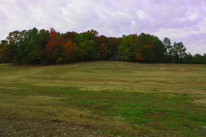
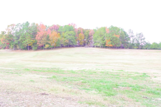
Comparison of normal and overexposed image.
Move the mouse over the picture to see the overexposed image,
augmented to have about the same brightness and saturation as the original.
Note the disappearance of yellow in particular. Yellows are shifted to
either green (grass, trees) or
red (autumn colours, sand at the bottom).
(original: Marshburn
photography)
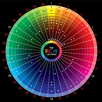
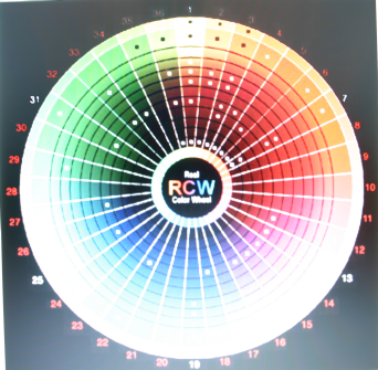
Top: original colour wheel.
Bottom, left: overexposed Sigma DP1
photo (0.8s, f/4), converted from raw using default settings.
Bottom,middle: same photo, but in-camera jpeg.
Bottom, right: overexposed Canon 300D photo (0.8s,
f/4), in-camera Jpeg.
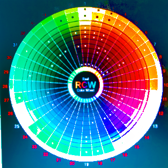
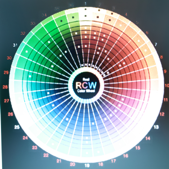
Top: colour wheel.
Bottom, left: hue map of overexposed Sigma DP1
photo of the wheel (0.8s, f/4), Raw.
Bottom, middle: hue map of same photo, in-camera jpeg.
Bottom, right: hue map of
overexposed Canon 300D photo (0.8s, f/4).
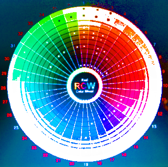
DP1 photo (raw). Move the mouse over to get the 300D photo.
There are some small
differences in exposure. For the DP1, the greens and blues seem less
overexposed, for the 300D the reds (note: the oranges were originally red!).
The DP1 seems to
retain highlights a little better in near-white areas.
Also, colour rendition is more accurate (see below).
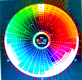
Hue map of DP1 photo (raw). Move the mouse over to get the 300D
photo.
Here you can more clearly see the difference in colour rendition of
almost all colours of the spectrum. The bluish greens and blues remain
accurate with the DP1, when brightness increases,
while the 300D makes them green or cyan.
The red-magenta and blue-magenta
also seems to be more faithfully rendered, as the 300D makes them resp.
magenta and red.
The DP1 has some anomalies in the almost-white areas: bluish green where blue
is expected, and orange where red-purple is expected.
It appears that the DP1 also renders darker colour better than the 300D.
Note that we are comparing in-camera 300D jpegs with DP1
raws. I'd prefer to use 300D raws as well except that I have no software to
convert them. See below for the difference in colour rendition
between DP1 raw and DP1 in-camera
jpeg.
Hue map of DP1 Raw photo; move mouse over to get the DP1 in-camera jpeg. The
hues are the same, only the in-camera jpeg tends to overexpose earlier (this
is typical; it is well known
the DP1 is not at its best shooting in-camera jpegs). Note however that the
overexposed areas in the jpeg mostly correspond to those
that are hue-shifted in the
Raw version.
Noise, signal to noise ratio, dynamic range, and denoising
Understanding image noise, one of the photographer's worst enemies, requires a
clear theory of the underlying sensing technology. We all know noise.
However, sadly most people reason about it without help of an accurate theory.
Consequently, there are a lot of misunderstandings about noise, dynamic range,
and sensitivity. Most noise assessments are made on the basis of subjective
judgement of the pictures that come out of the camera, which may have been
postprocessed by any number of heuristic postprocessing steps. Consequently
it may be the case that a bad sensor with an aggressive in-camera de-noising
algorithm may produce a result of which people think it is actually low-noise.
What is really low-noise can however only be determined if we can also
determine at what level a signal disappears (signal-to-noise ratio).
Sensor noise has several components:
The base-level background noise. This includes readout noise, quantisation
noise of the A/D converter. This is a pretty hard lower bound below which
signal can no longer be measured.
"dark current" noise, i.e. spontaneously generated electricity over time.
This noise is
a function of the length of the exposure, and becomes a problem only for
longer exposures.
Because the amount of electrons generated for each photosite is different,
this results in noise. It can be (partially) reduced by the "dark frame
subtraction" technique.
brightness-related noise. Fewer people know that noise also inc
Because
This can be