Relatively well known is that photosites have a hard upper bound on the amount of light that they can measure. This upper bound is also known as "well capacity", the amount of electrical charge a photosite can carry before it overflows. What happens when well capacity is exceeded is rather complicated, and differs from sensor to sensor. Possibly, the excess electricity flows away, to nearby photosites or somewhere else. But let's assume for now that the sensor is well-behaved and no ill side-effect occurs from (mild) overexposure.
I noticed that some cameras produce colour shifts in overexposed situations. For example, my Canon A40 would produce a strong orange cast in bright reds, and my DP1 sometimes does the same thing in its live view (though nothing of this is seen in the final picture). This is most easily seen in red flowers, some of which are extremely saturated, well beyond the colour gamut of a regular computer screen.
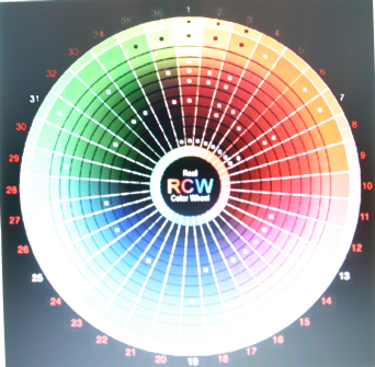
Others have remarked this apparent "colour bleed" problem. It might be caused by electricity flow, or by some optical effect, but I think there is a simpler explanation. Let's start by looking at the colour response of the photosites of an average camera sensor:
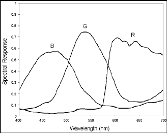
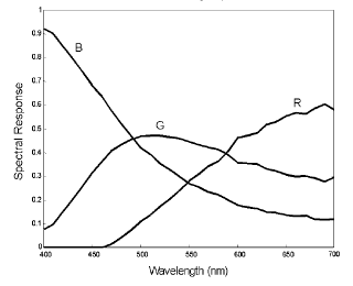
As you can see, there is a certain overlap between the primary colours red, green, and blue. Most targets, even those in pure colours, will show up on at least two photosites (say, our target is scarlet: scarlet is just red with a little green). For the Foveon the overlap is even larger, and most targets, even the most saturated colour, will be seen by all photosites.
Normally, this is not a problem, as the expected colour is produced. However, there is trouble when one of the colours reaches its well capacity, say, the red of our scarlet flower. Since nearby green photosites have not yet reached their capacities, any further exposure will produce more green response, but no more red response. This results in a strong and abrupt orange colour shift above a certain exposure level. So, the more overexposed the picture, the less accurate colour and luminance information become. At a certain point, even two of the three colour channels will reach their capacities, and the object will look pure cyan, magenta, or yellow, regardless of its actual colour.
The camera can correct this problem by sensing that one channel has reached its well capacity, and regarding the colour information from the combined channels as false. The camera cannot reconstruct the original colour; however, the camera can degrade the image gracefully by showing such overexposed areas as less saturated and near-white. Just below the point that a channel reaches its capacity, the camera can start "whitening" the colour, so that it is white or near white in the areas where the channel does reach its capacity. From that point on, the information from the other channels just determines the final bit of brightness or is simply ignored.
One interesting question is what kind of heuristics cameras use to hide the inaccuracies and reconstruct the original colour. I believe this is why highly saturated colours become less saturated and "whitened" on most digital cameras, and why the "raw" information typically does look more accurately saturated. This story also gives a more complete picture on why washed out overexposed areas look the way they do.
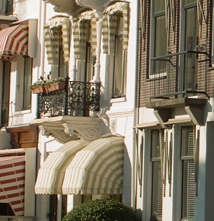
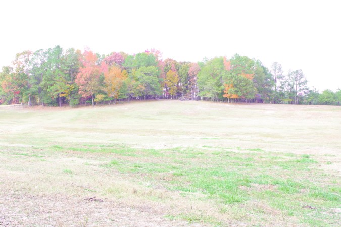
On both the upper and lower figure, look at the second detail from the right. These are similar and are taken under similar conditions. The Foveon version looks a little more natural. The walls are not as orange. Note in particular the blue-green gutter, which looks cyan on the Bayer, and green-green-blue on the Foveon. The green-green-blue is closer to the real thing.
There is a difference in brightness between the DP1 raw and the 300D jpeg, which seems to be the result of a different contrast curve (see also the discussion below)
There are some small differences in overexposure. For the DP1, the greens and blues seem less overexposed, for the 300D the reds (note: the oranges were originally red!). The DP1 seems to retain highlights a little better in near-white areas. Also, colour rendition is more accurate (see below).
The DP1 has some anomalies in the almost-white areas: bluish green where blue is expected, and orange where red-purple is expected.
It appears that the DP1 also renders darker colour better than the 300D.
Note that we are comparing in-camera 300D jpegs with DP1 raws. I'd prefer to use 300D raws as well except that I have no software to convert them. See below for the difference in colour rendition between DP1 raw and DP1 in-camera jpeg.
A dynamic range test, in which exposure was lowered in the DP1 raw, and the in-camera contrast setting was lowered on the 300D, showed that there was not much detail that could still be pulled out of the pure-whites that you see in the above pictures. On the 300D, setting contrast to lowest did not produce any extra detail in the whites. On the DP1, between 0 and 0.6 stops of (desaturated) highlights could still be pulled out, depending on the colour.
This suggests that the dynamic range in the sense of the contrast between shadow areas and pure-white level is similar.
The observed difference in contrast curves is just one of the things that make this kind of data so hard to interpret. I will try to explain what I think is going on here.
First, observe that the DP1 jpeg overexposes significantly earlier. If we look at the differences with the DP1 raw, it appears that the jpeg becomes white at precisely the point that the DP1 raw start suffering from colour shifts. I believe this is the point at which one of the sensor's channels becomes overexposed. The jpeg simply gives up here; the raw still tries to produce colour by accepting a lower colour accuracy. The canon's jpeg behaviour is similar to the DP1 raw: it overexposes later by accepting a lower colour accuracy. In particular the points at which the blue-cyan shifts happen are telling in the above figures.
The reason why both the Canon and DP1 jpeg are brighter in the bright areas is because they are trying to provide a smoother transition to the near-white and white areas. The DP1 does this because it transitions early to pure white; the 300D because it is trying to hide the colour inaccuracies by gradually whitening the colour in the colour-shifted areas.
It now becomes apparent why the DP1's colours looks darker, bolder: it's
because its colour in near-white areas is more accurate. This confirms the
theory we proposed at the beginning. This data suggests that the Foveon does
not have higher dynamic range per se (in the sense of the difference of
intensity between the pure-black and the pure-white point), but rather, that
it produces more faithful colours in highlights, and therefore, that it
overexposes more gracefully. In other words, the Foveon
overexposes as quickly, but the near-overexposure is rendered more naturally,
and hence, overexposure
looks more like "just very damn bright" rather than "badly washed
out".
Boris van Schooten
schooten@cs.utwente.nl